
Charts and reports
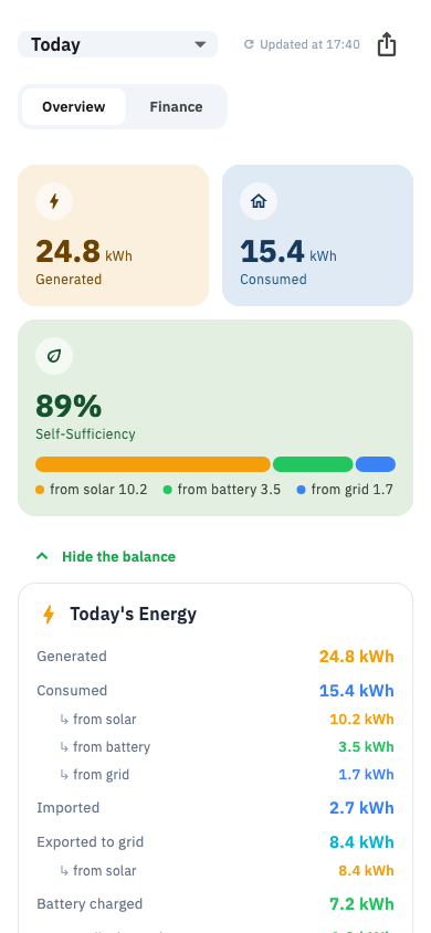
The history of your system: how much you generated and used, split by source, and what it all cost or earned.
Reached from the Charts tab. Two sub-tabs: Overview and Finance.
Choosing a period
Week · This month · Last month · Year · or a custom range. Everything on both tabs follows the period you pick.
Overview
- Totals — generated, consumed, imported, exported for the period.
- Where your power came from — solar, battery and grid as a split bar.
- Production heatmap — a grid of days and hours. A genuinely zero hour and an hour where nothing was collected are drawn differently, so a gap in your data never masquerades as a night.
- Hourly profile — for today, the shape of the day so far.
- Battery charge curve — how full the battery was across the period.
- Change vs the period before — this week against last week.
Finance
- What you paid the grid, on your real tariff including day and night zones.
- What you earned exporting.
- Green tariff settlement — the month it covers, and what it worked out to.
- Savings — what the solar system saved you against buying everything from the grid.
All of it depends on having your tariff set up correctly. See Electricity tariff.
Compare
Puts this period next to the previous one: generated, consumed, imported, exported, peak solar, peak load, net saving.
Export to CSV
Writes the selected period to a spreadsheet file you can open in Excel or send to your accountant.
Where the numbers come from
Reports are built from stored history, and stored history only exists for hours your collector was running. A month with a week of missing collection will read low, and no amount of refreshing will fill it in. See Data quality.